
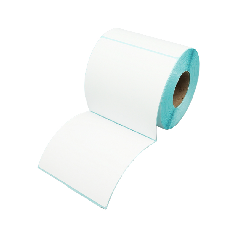


How does a white/blue grid background design improve the readability and alignment accuracy of printed tag paper?
Release Time : 2026-01-19
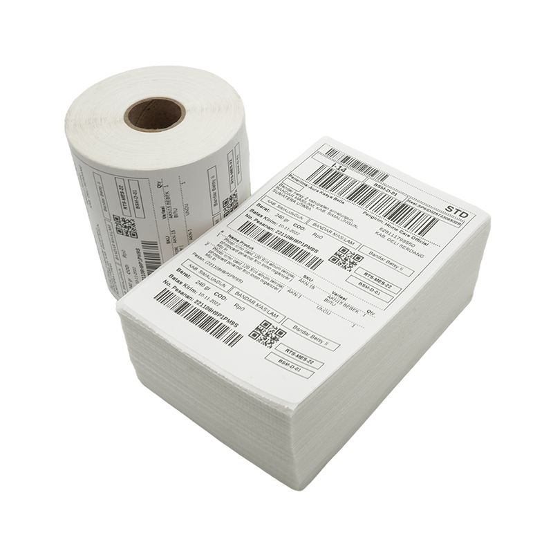
In modern logistics, warehousing management, and retail operations, packaging labels are not only carriers of information but also key guarantees of efficiency and accuracy. A seemingly ordinary thermal tag paper, if printed with a fine white or light blue grid pattern, can play a role far beyond decoration in practical use—acting like an invisible ruler and visual guide lines, it significantly improves the readability and alignment accuracy of the content throughout the entire process of printing, pasting, and even manual verification, thereby reducing misreading, mis-pasting, and rework.
First, the grid lines provide a natural visual reference system for the printed content. When a thermal printer outputs text, barcodes, or QR codes, the starting position of characters, line spacing, and overall layout are easily skewed due to template setting deviations or slight paper shifts. A light-colored grid (usually light blue or light gray) covers the entire label surface with uniform horizontal and vertical lines, forming a stable coordinate background. When previewing or checking the print effect, operators can quickly determine whether the content is centered, whether the text is straight, and whether the barcode falls completely within the designated area. Especially in batch printing, if a label is noticeably misaligned, the grid makes the anomaly immediately apparent, facilitating timely shutdown and adjustment, and preventing hundreds or thousands of labels from being scrapped due to minor misalignments.
Secondly, the grid aids in the standardization of manual handwriting and supplementary information. Although most information is automatically generated by the system, in real-world scenarios, warehouse staff often need to handwrite batch numbers, quality inspection marks, or temporary notes. The white/blue grid provides "invisible grids" for this: letter heights align with horizontal lines, and number spacing follows the vertical columns, ensuring neat and orderly handwritten content without overlap or overflow. This structured writing not only improves visual neatness but also significantly reduces the risk of misreading due to illegible handwriting. Simultaneously, the light blue grid is visually clear enough for guidance while being soft enough not to interfere with the barcode scanning equipment's recognition of black and white contrast—a balance that dark or high-saturation backgrounds cannot achieve.
Furthermore, in the labeling process, the grid becomes an auxiliary tool for precise positioning. Many packaging boxes or containers have strict requirements for label placement, such as being 2 cm from the edge or centered on the side. The grid-patterned tag paper itself acts as a "flexible ruler," allowing operators to quickly estimate positions based on the grid number for visual alignment, eliminating the need for additional measuring tools. Especially on high-speed sorting lines, this intuitive reference significantly improves labeling consistency, ensuring smooth reading by subsequent automated scanning systems.
Furthermore, the white background enhances the contrast of thermally sensitive colors. The white base reflects light to the maximum extent, resulting in a high-contrast effect for the black or dark text formed by the thermal coating when heated. Even in poorly lit warehouse corners or on fast-moving conveyor belts, it can be clearly captured by the naked eye or a scanner. The light blue grid serves as a low-interference background, retaining the high-contrast advantage of the white background while adding functional guidance—a clever fusion of "function and form."
Ultimately, the white/blue grid pattern is not merely a simple decorative element, but rather a clever integration of engineering thinking into the details of everyday consumables. It doesn't overshadow the material, but silently provides support in every print, every handwritten note, and every sticker. When a label accurately transmits information in the complex logistics chain, it is perhaps this fine mesh that silently safeguards the efficiency and reliability of the modern supply chain—small design, big impact.